Improving UX Copy to Boost Adoption at DOS

April 2024 - June 2024
The Department of State has a web application called STEP (Smart Traveler Enrollment Program) that went through a modernization effort in 2024. However while the UI was modernized, it was never tested with real users before its launch prior to the 2024 Pairs Olympics. We were tasked with conducting usability testing on the STEP application 3 months prior to its launch and recommend short term and long term changes that would improve the user experience to in turn increase adoption of the application. The STEP application allows U.S. citizens to register their upcoming international travel with the State Department as well as enroll in travel messages, both with the goal of increasing traveler safety while abroad. In the event of an emergency, the State Department could know how many U.S citizens were in a country at any given time. The travel messages were also meant to improve traveler safety.
what we did
The project had an extremely expedited timeline as we were brought in at the very end of the modernization effort which added an additional challenge when it came to the changes we could realistically make and recommend for the short term. In the end we were able to influence copy changes, as in the text on pages and buttons, to improve the user experience dramatically that would result in increased adoption of the application.
Why it mattered
Increased adoption of STEP translated to safer citizens travelling abroad which was the State Department’s priority. The usability testing we conducted revealed that there were severe usability issues that would cause users to abandon the process of enrolling a trip or subscribing to travel messages. One aspect of this project different from other federal projects I’ve worked on is that the use of STEP is fully optional in comparison to other government applications that you are required to use in order to obtain a permit to operate a business or file your taxes. Ease of use is always a priority when designing for government, but it was especially crucial here.
My roles
UX Researcher
UX Designer
tools
Zoom
Mural
Figma
What I Made
Mockups illustrating copy changes
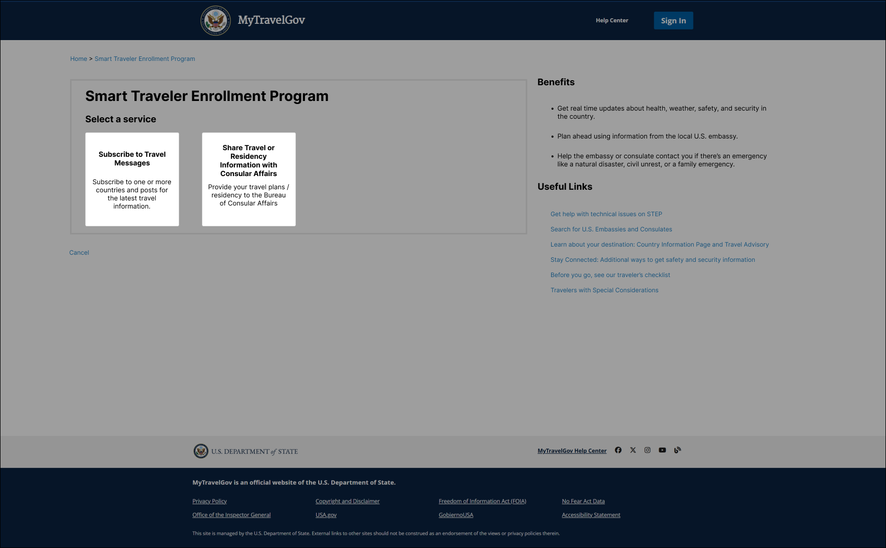
Understanding STEP
Who’s using STEP?
STEP’s primary users are U.S. citizens who are either planning international travel or currently living abroad. One of our key research goals was to understand how each of these user groups actually engaged with STEP’s two main services: trip enrollment and message subscriptions. Did they engage with each equally, or did they see value in one over the other?
The urgency behind this research effort stemmed from the upcoming 2024 Paris Olympics. With a surge of U.S. citizens expected to travel abroad, the agency anticipated a large number of first-time STEP users—and the product had never been tested with real users before. This posed a significant risk. If the experience was confusing or unreliable, STEP could gain national attention for all the wrong reasons. No one wanted it to become a cautionary tale in the headlines. This research was a critical effort to identify pain points and improve clarity before STEP launched. However, the changes we were able to implement were extremely limited. We still managed to improve the product and de-risk its launch!
Is step helping or hindering users?
From the very first time we tried using STEP ourselves, it was clear that certain aspects of the experience could easily deter someone from completing the process of enrolling in either of its services. We suspected that a major source of user frustration would come from simply trying to access the application—and that suspicion was confirmed through usability testing with real potential users.
Unlike many government products, STEP is completely optional. There's no legal requirement or urgent necessity that forces people to use it. That means the experience has to be clear, trustworthy, and effortless—otherwise, users will simply abandon it. In most government systems, users are motivated to endure outdated, frustrating platforms because they need something critical on the other side: a permit, a benefit, access to services. But STEP doesn’t carry that same urgency or obligation. For users to see its value and follow through, the experience needs to earn their trust and make it easy to engage.
testing step
Hybrid sessions
This was likely the first — and possibly the last — opportunity to gather direct user input for STEP. In government work, it's not uncommon for research to begin and end with a single contractor’s tenure, so we knew we had a narrow window to collect meaningful insights that could inform both near and long-term improvements.
Given this context, we designed our sessions to be both evaluative and generative. We included some standard usability tasks and tracked metrics like success rate, but our primary focus was on discovery. We aimed to uncover broader pain points across the application, understand how STEP fits into the lives of travelers and overseas citizens, and identify new opportunities to add value.
This approach felt like the most impactful way to use our limited time — balancing short-term needs with the chance to surface deeper insights that could influence the product well beyond our engagement.
-
We recruited participants based on the two potential user groups for STEP: those who take short-term trips overseas and those who prefer to stay as long-term residents in other countries, whether for work, military service, or as expatriates.
Within these two user groups, we also tried to recruit users with varying prior experience and knowledge of STEP:
Users who were unfamiliar with STEP
Users who were returning users of STEP
Eight participants were selected for the interview process. The mix of participants included three long-term residents and five short-term travelers. Across the two groups, they represented all levels of experience and travel across the globe.
-
Sessions lasted about one hour and were conducted remotely over Google Meet. Customers shared their screens with the research team so that their interactions with STEP 2.0 could be captured along with their spoken thoughts.
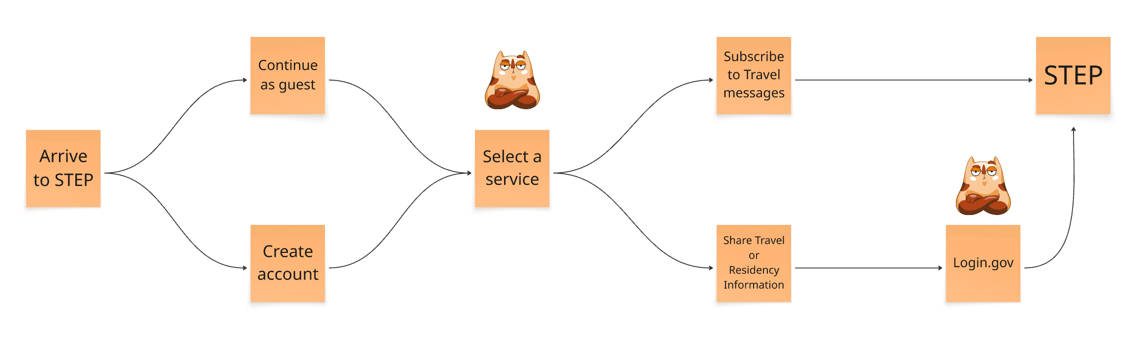
We identified several distinct phases based on the user journey:
Entering STEP
Signing up for travel messages
Enrolling a trip
Receiving an alert
These informed the “tasks” we asked participants to complete.
-
As mentioned earlier, our sessions were designed to gather both evaluative and generative insights. For example, beyond observing whether users could successfully complete a task like "Entering STEP," we also explored their preferences— like whether they chose to continue as a guest or create an account. This helped us compare actual user behavior with the State Department’s intended goals for the product.
What we found was that these business goals—like encouraging users to create accounts or enroll trips—often fell short because they were based on assumptions rather than user evidence. By gaining a window into users’ mindsets, we could identify what they needed to know, feel, or trust in order to take the desired actions. These insights allowed us to make targeted recommendations for how to better align the experience with both user needs and business objectives.
The sessions yielded a wealth of insights that informed both short-term changes ahead of launch and longer-term strategic opportunities. We identified the most critical usability issues by looking at how frequently they occurred and how significantly they disrupted participants’ workflows.
The sessions also helped us start to differentiate what each user group, travelers vs. overseas citizens, valued most about STEP. As this was the State Department’s first direct engagement with STEP users, our research helped answer broader, long-standing questions about user needs and behavior. We believe this work helped shift the agency’s mindset on gathering user feedback and encouraged ongoing investment in research and iterative improvements beyond our engagement.
WhAT WE LEARNED
Unclear Value Proposition
Users struggled to understand the purpose and benefits of STEP. They weren’t convinced it was worth the time and effort to enroll a trip, sign up for messages, or create an account. The overall value of the program needed to be communicated more clearly and upfront.
“I would like to have a better idea of the goal behind STEP, why should I sign up for it? There’s not enough information here to convince me to sign up.“
-Short Term Traveler
Confusing Service Differentiation
Participants were unsure why they had to choose between different STEP services (e.g., enrolling a trip vs. subscribing to messages). Many expressed interest in both, but the interface presented them as mutually exclusive without explaining the differences or allowing flexibility.
“You should probably add more information, helping people to understand why they should choose a particular choice. I, as a lay person, wouldn’t understand the benefits of choosing either of these options.“
-Resident Abroad
Frustrating Guest Experience
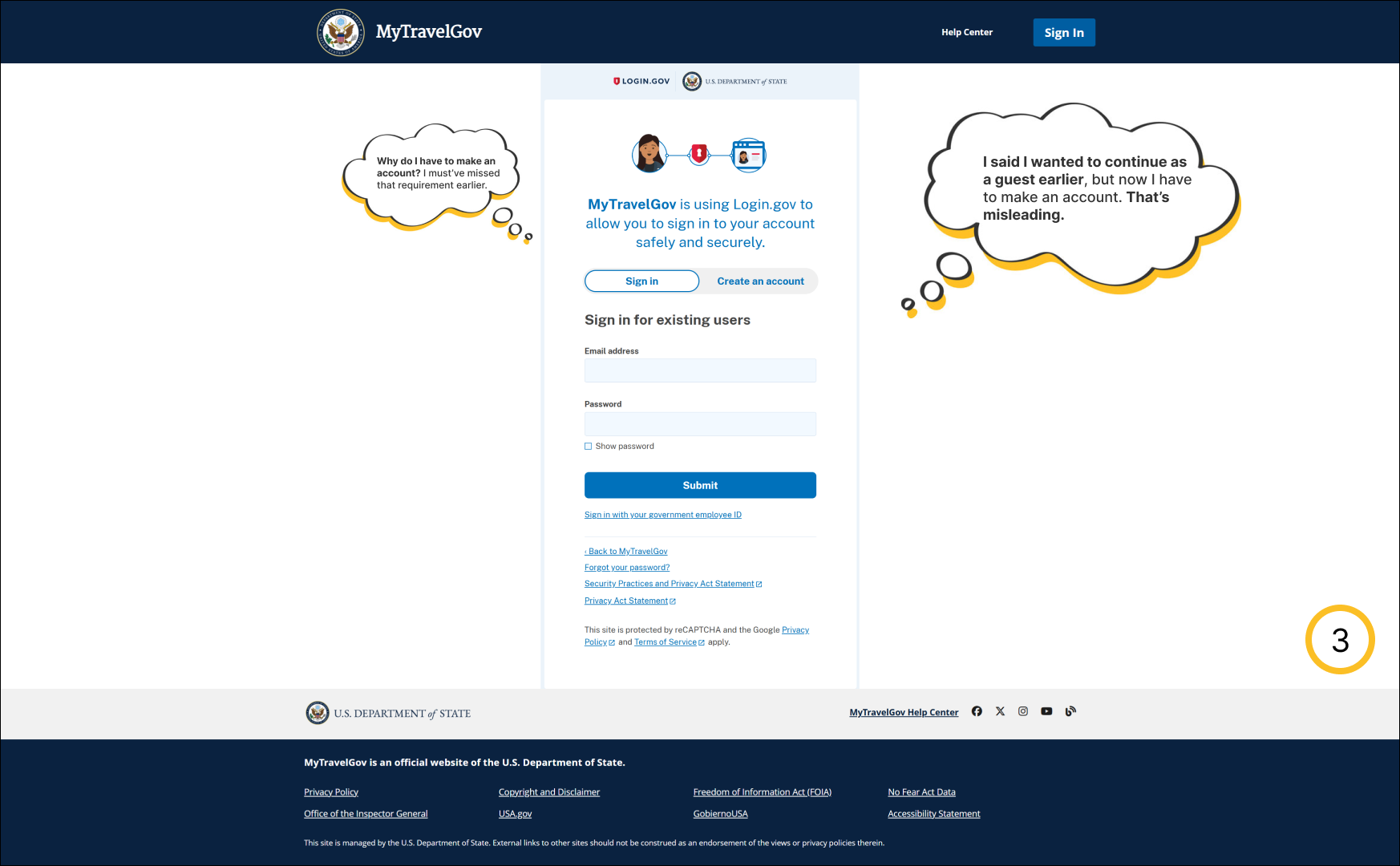
Users felt misled by the option to “continue as guest,” only to later be required to create an account. This inconsistency eroded trust and made users feel tricked rather than supported. Some participants said they would’ve abandoned the process at that point.
“I guess my guest tenure is at an end. I went down a hallway, but now I am back at this screen. I did not get any information I was hoping to get as a guest.“
-Short Term Traveler


Confusing Onboarding
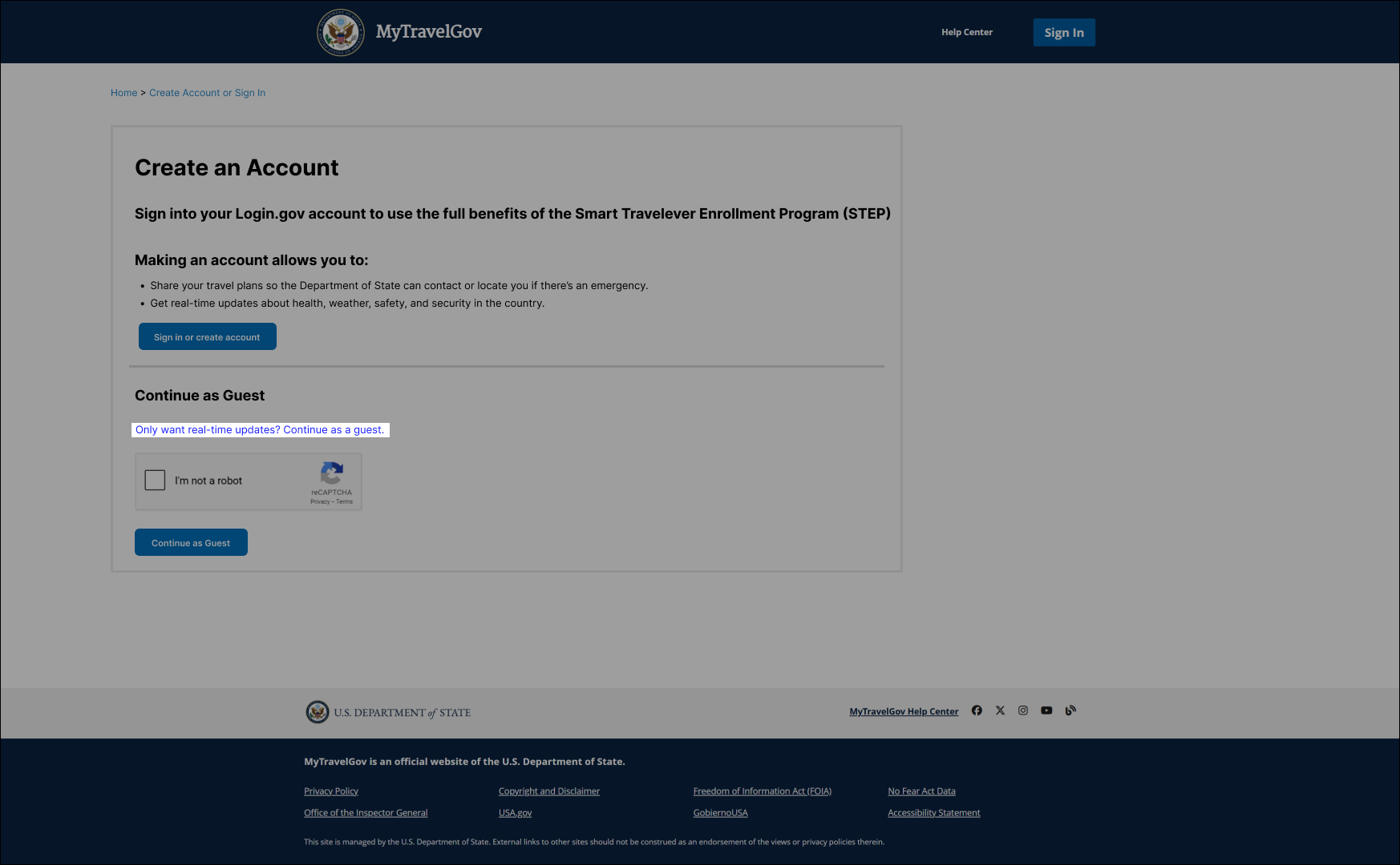
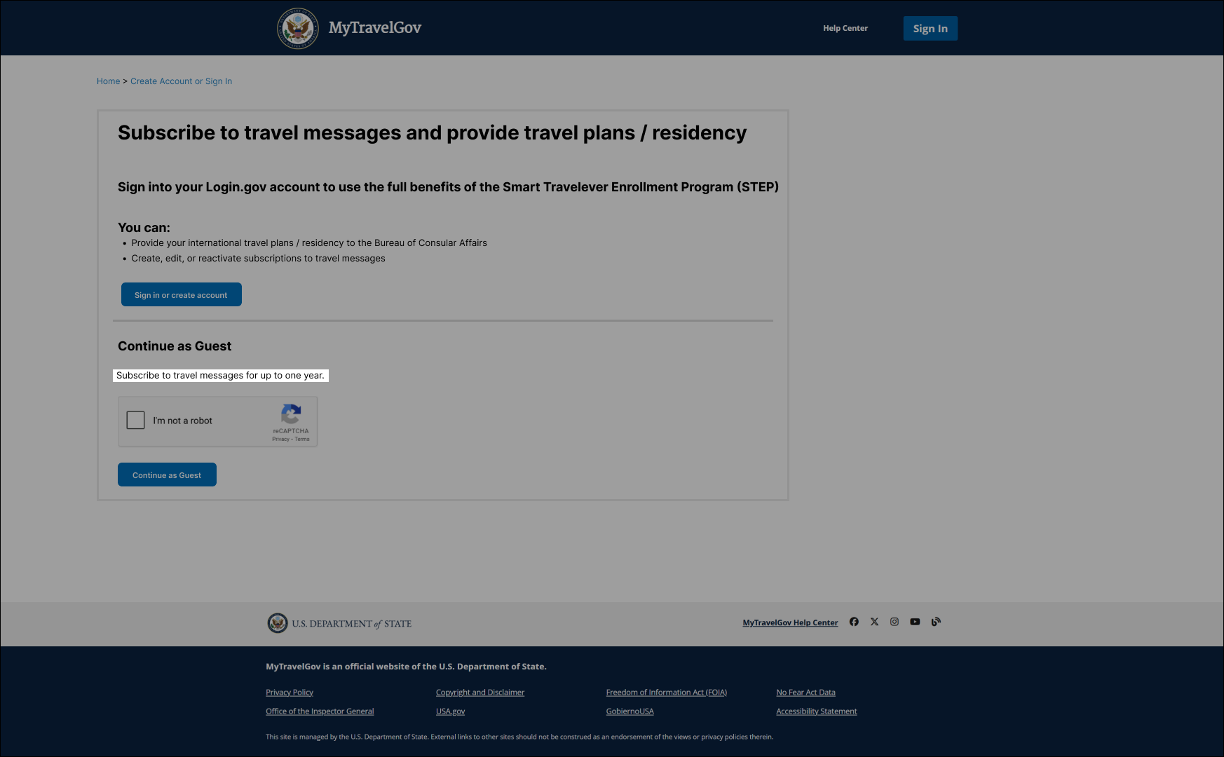
The three primary points of friction identified in our research were most prominent in the first two screens of the STEP onboarding experience, as illustrated in the screenshots above. We believed that even small, low-lift changes on these screens could have a meaningful impact on reducing confusion.
The onboarding flow was especially frustrating for users due to the sequence and language of the decisions they were asked to make. Upon arriving at STEP, users were prompted to choose between continuing as a guest or creating an account. However, after making that selection, they encountered a second screen asking them to choose a service—either enrolling a trip or subscribing to messages. This caused confusion for many participants. Some believed they had already made their choice by selecting guest or account, especially since that first screen included brief descriptions of what each option allowed.
Users who created an account expecting access to both services were surprised to see them presented as mutually exclusive. This directly contradicted the expectations set by the previous screen. Participants who chose to continue as guests often did so out of habit to explore the site before committing to an account. Many missed the small print explaining that the guest option only allowed message subscriptions. When they reached the service selection screen and chose to enroll a trip, they were unexpectedly met with a login prompt. This abrupt interruption was jarring and frustrating.
Regardless of whether participants chose to continue as a guest or create an account, they encountered issues when the interface failed to match their expectations based on earlier choices. These mismatches were largely driven by unclear and misleading language on the screens.
improving step
“fix it, but don’t change anything”
We weren’t explicitly told, “Don’t touch anything,” but the sentiment was clear. As you might expect, there wasn’t much appetite for major design overhauls right before launch. We were brought in late in the process, and the scope for what we could change was extremely limited: no structural redesigns, no layout adjustments, and no UI changes that required touching the code. We could only change the words on a screen.
The good news was that words matter more than people realize. Even small changes in copy can reduce friction, clarify intent, and build trust with the user. These were all things STEP was struggling to do in its current state. This project reminded me that while yes, “no one reads,” what they do read has an impact on the user experience. In this case, carefully rewriting labels, instructions, and button text was one of the most powerful tools we had—and it made a meaningful difference.
Focus improvements on 2 key screens
Since our sessions revealed that most user friction occurred on the first two screens of the STEP experience, this created confusion and eroded trust from the outset. While we could only revise the wording within the screens, we did recommend that they try to consolidate these two screens in the future as we saw the second screen to just be a more confusing and repetitive version of the first screen. Since we could only change the wording on each screen, figuring out how to reduce confusion and build trust through language alone was important.
In their current state, they were turning users away before they even began the core tasks they came to STEP for. Given that STEP requires users to share personal information with the State Department, and participation is entirely optional, trust and ease of use are critical. Too often government products rely on users to push through poor experiences to access essential services, but STEP does not have this incentive.
To build trust and ease of use within the limited scope of what we could change and improve, we anchored our copy changes to the three core goals that came out of our research: improve how the value proposition of STEP was communicated, clarify the differentiation between service offerings, and improve the guest experience.
improved value proposition
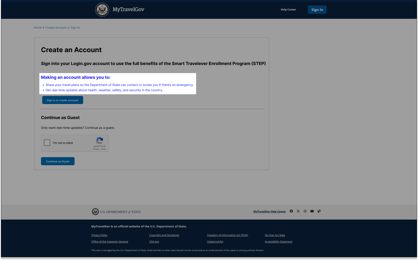
Many users struggled to understand why they should use STEP at all, let alone why it was worth the effort of creating an account. The previous version of the experience assumed users already understood the value of STEP, but in reality most didn’t.
Our changes focused on clearly communicating not just what STEP offers, but why it matters—specifically how creating an account unlocks additional services that can lead to a safer, more informed travel experience. By replacing vague and repetitive language with copy that was more specific and focused on the details that mattered to users, we had a better chance of increasing STEP’s overall adoption and total accounts created.
We replaced copy in two specific places: where users choose to create an account and where there was a generic “Helpful Links” section, which participants said they were unlikely to click. We incorporated language that more specifically communicated the benefits of creating an account and more details about the travel messages users wished they had. This included information on the types of messages they could expect, how frequently they’d receive them, and what kind of content those messages might include.
An example of a copy change
Before: You can provide your international travel plans / residency to the Bureau of Consular Affairs and
Create, edit, or reactivate subscriptions to travel messages.After: Making an account allows you to share your travel plans so the Department of State can contact or locate you if there’s an emergency and get real-time updates about health, weather, safety, and security in the country.
Improvements are shown as blue text in the screenshots.

Before
After
After

Before
Better Service Differentiation
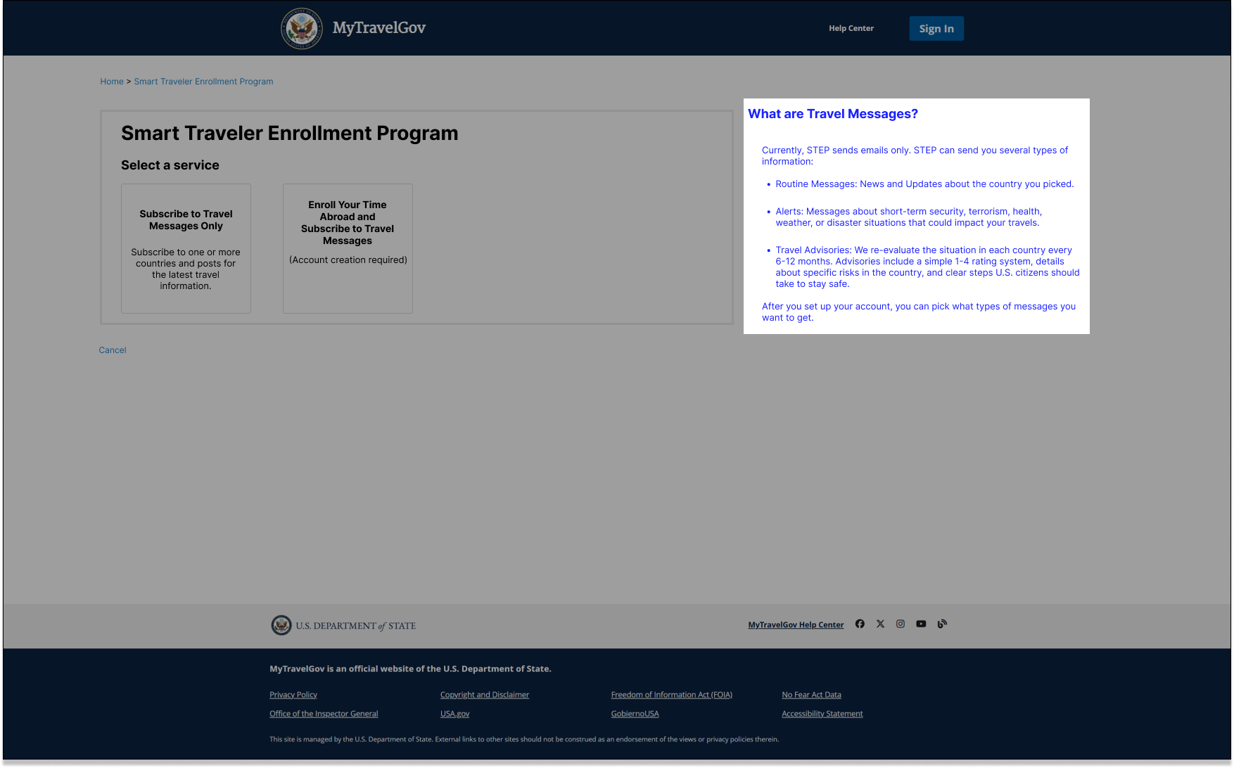
Many participants expressed a desire to use both of STEP’s core services: enrolling their travel plans and subscribing to travel messages. However, they were confused by a mismatch between the first and second screens. On the first screen, users were told that creating an account would give them access to both services. But on the second screen, they were asked to choose between the two and made them appear mutually exclusive.
We later discovered this was not a limitation of the system, but rather a messaging error in the interface. In reality, users with an account could access both services. To correct this, we updated the second screen to read: “Enroll Your Time Abroad and Subscribe to Travel Messages”—reinforcing that both actions were possible through the account path.
Additionally, to make the guest path clearer, we added the word “only” to clarify that continuing as a guest would only allow users to subscribe to travel messages. This distinction helped reduce confusion and ensured that users understood the implications of their choices upfront.
After
Before

After
Before
Better Guest Experience
One of the most frustrating aspects of the original STEP experience was how easily users could be led down the wrong path. Specifically, choosing to continue as a guest without fully understanding the limitations of that choice. While the first screen technically included a small line of text indicating that guest users could only subscribe to travel messages, most participants overlooked it. This wasn’t surprising as people typically skim rather than read every word, especially when scanning an interface for the first time.
As a result, many users who chose the guest path out of habit or curiosity were later met with a login screen when they tried to proceed and this abrupt interruption felt misleading.
To address this, we updated the second screen to include a clear, visible message stating “Account Creation Required” near the call to action. This served as an additional warning for users who might have missed the fine print on the previous screen. The original text in this area just restated the bolded header above, offering no new or useful information. By replacing it with a more relevant and actionable message, we helped manage user expectations and reduce the feeling of being “tricked” or surprised later in the process.

Before

After
Longer term effects
Our work on this short project demonstrated that even small, research-informed changes can make a significant difference in improving the user experience. By addressing a few key pain points, we were able to reduce confusion, build trust, and help users complete their tasks more easily—without expanding the project’s scope or timeline.
This showed the State Department firsthand that usability testing and user feedback aren’t just valuable at the beginning of a project. They’re important at any stage of the product lifecycle. While there’s often a fear that user research will derail plans or slow things down, our work proved the opposite. Research can reveal low-effort and high-impact opportunities that help a product improve and better meet user needs.
After our engagement ended, another team picked up where we left off and continued building on our work and applied usability improvements to other areas of the application. This further validated the long-term value of making user research a core part of the process.